Check synchrony in the number of measles cases between SEA countries
Method: wavelet analysis to assess
Seasonal pattern (1 year cycle, depends on school year, etc.)
Multiannual patterns (multiple years, typically years between major epidemics)
Data processing
Load data
Load measles epicurve data for SEA countries
suppressMessages(library(tidyverse))library(janitor)library(plotly)library(patchwork)world_epi_curve <- readxl::read_excel("data/404-table-web-epi-curve-data.xlsx",sheet ="WEB")# --- preprocess ----- world_epi_curve <- world_epi_curve %>%clean_names() %>%mutate(date =ym(str_c(year, month)),measles_clinical =as.integer(measles_clinical) ) filtered_countries <-c("Viet Nam", "Thailand", "Cambodia", "Malaysia", "Singapore", "Myanmar", "Philippines","Brunei Darussalam", "Timor-Leste", "Indonesia","Lao People's Democratic Republic")# get epi curve of South East Asia countriessea_epi_curve <- world_epi_curve %>%clean_names() %>%mutate(date =ym(str_c(year, month)),measles_suspect =as.integer(measles_suspect),measles_clinical =as.integer(measles_clinical),measles_epi_linked =as.integer(measles_epi_linked),measles_lab_confirmed =as.integer(measles_lab_confirmed),# NOTE: recompute measles total since some epi-linked cases are negative (e.g. record for Indonesia on 2016-10-01)# definition: t sum of clinically-compatible, epidemiologically linked and laboratory-confirmed casesmeasles_total =abs(measles_clinical) +abs(measles_epi_linked) +abs(measles_lab_confirmed) ) %>%filter( country %in% filtered_countries )
Clean data
The column used for incidence data is measles total (sum of clinical compatible cases, epi-linked cases, laboratory confirmed cases)
Make sure the the time series is even-spaced
Check % of missing data from each of the 11 SEA countries
Generate evenly spaced time series for all countries
View the percentage of data points where incidence==0
Get country with most incidence report being 0
percent_zero <- sea_epi_curve %>%group_by(country) %>%summarize(percent_zero =sum(incidence ==0)/n() ) %>%arrange(desc(percent_zero) ) # filtered out countries where percent of data points where incidence = 0 > 50%high_pct_zero <- percent_zero %>%filter(percent_zero >0.5) %>%pull(country)
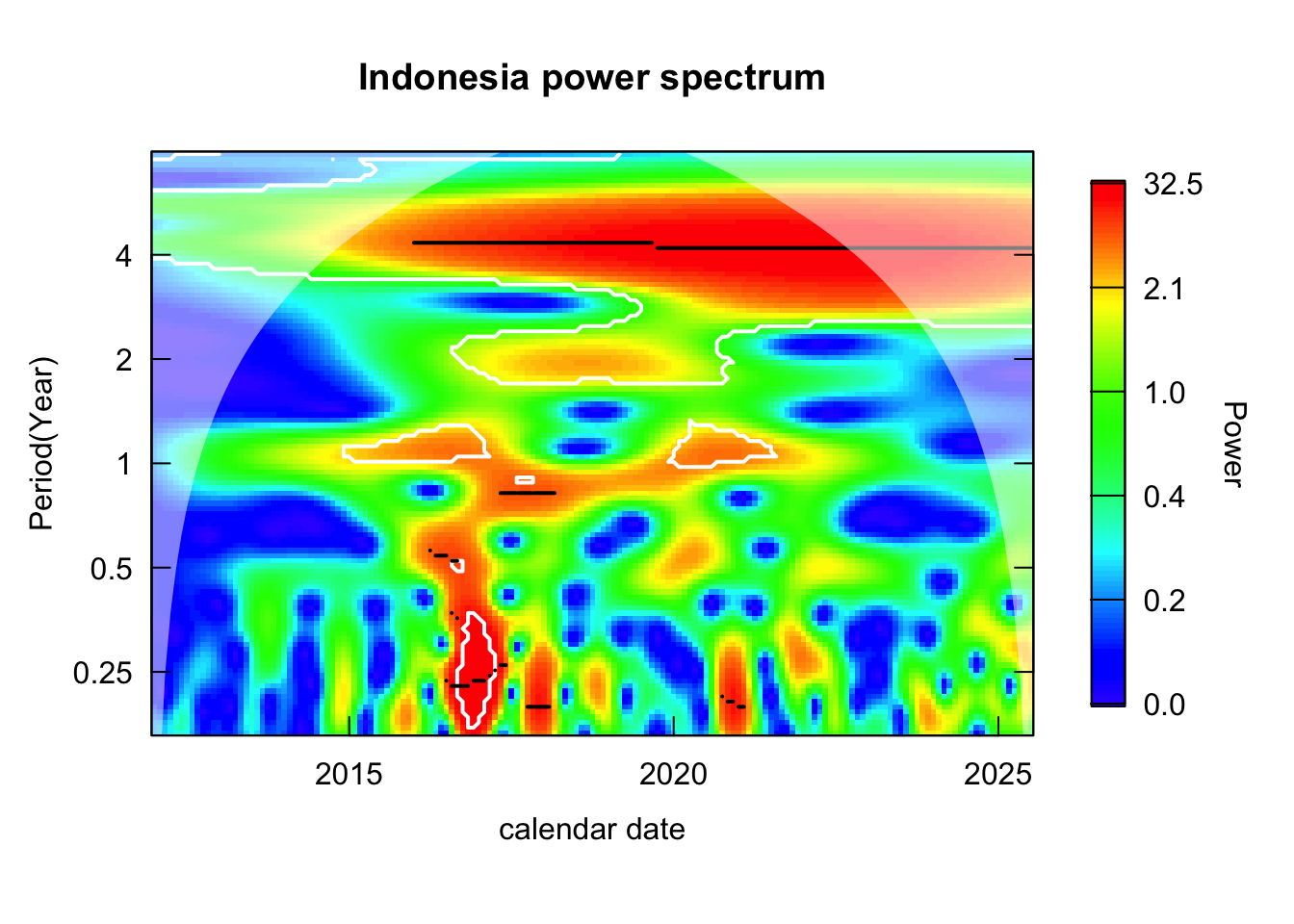
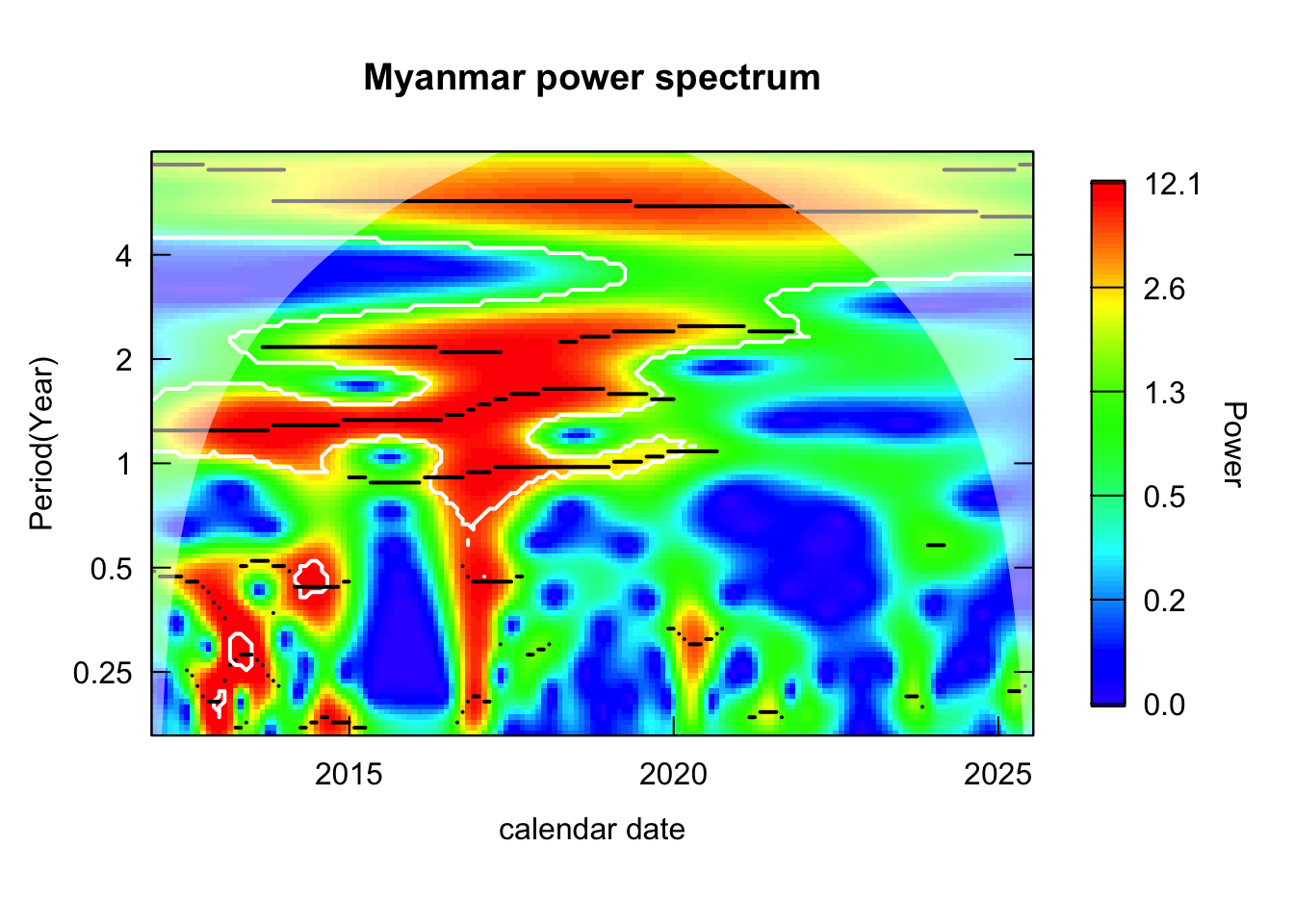
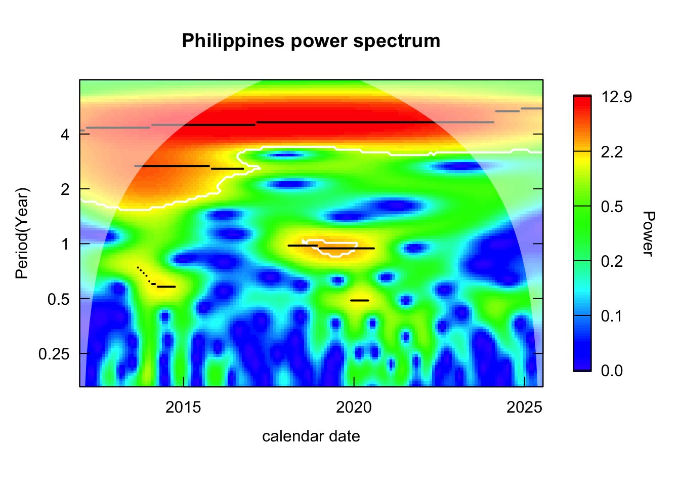
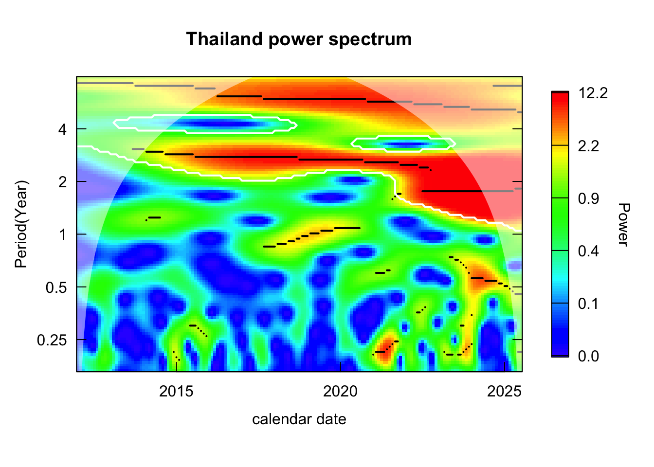
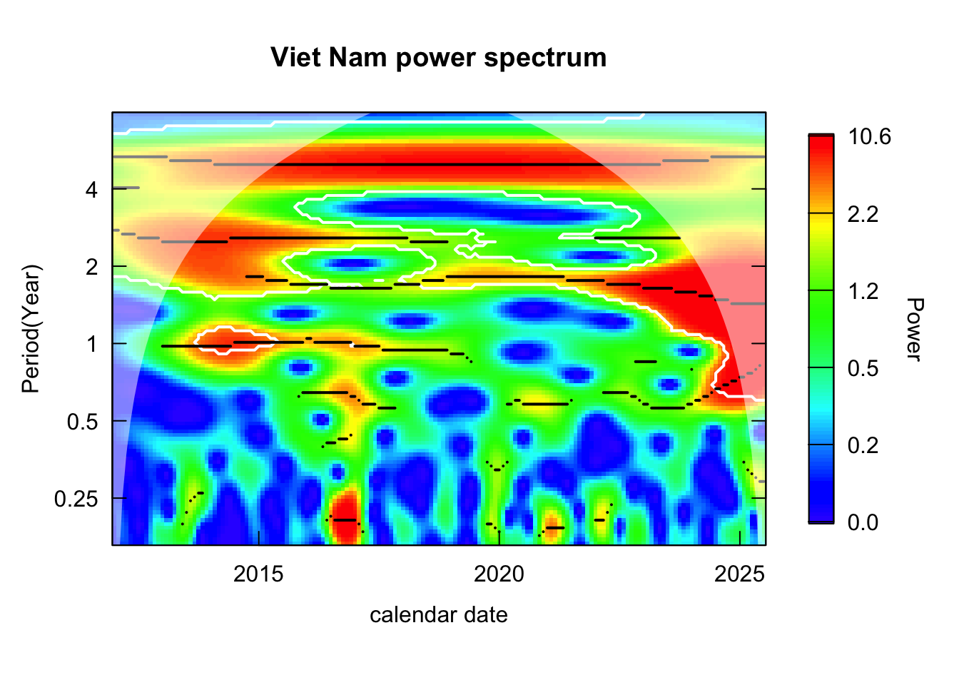
Inspect the power spectrum across time-period domain: identify the period that is consistently high over time, which indicates recurring cycles in the time series.
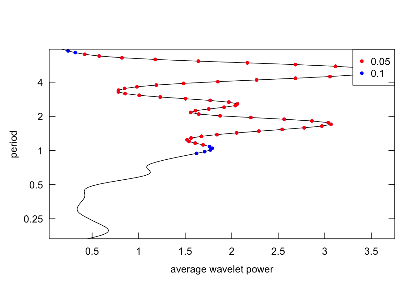
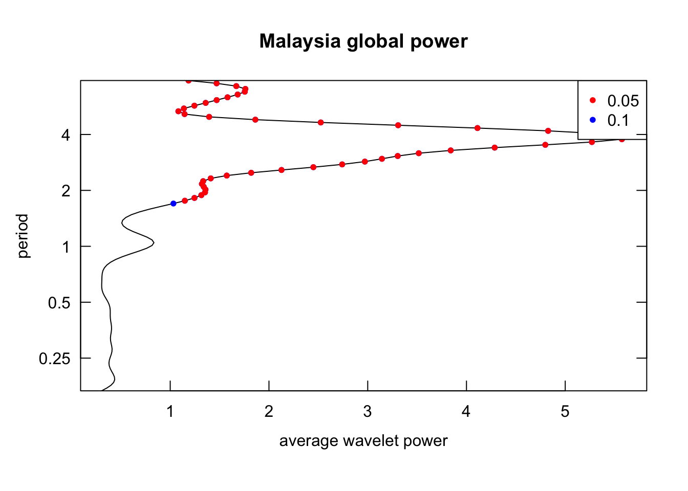
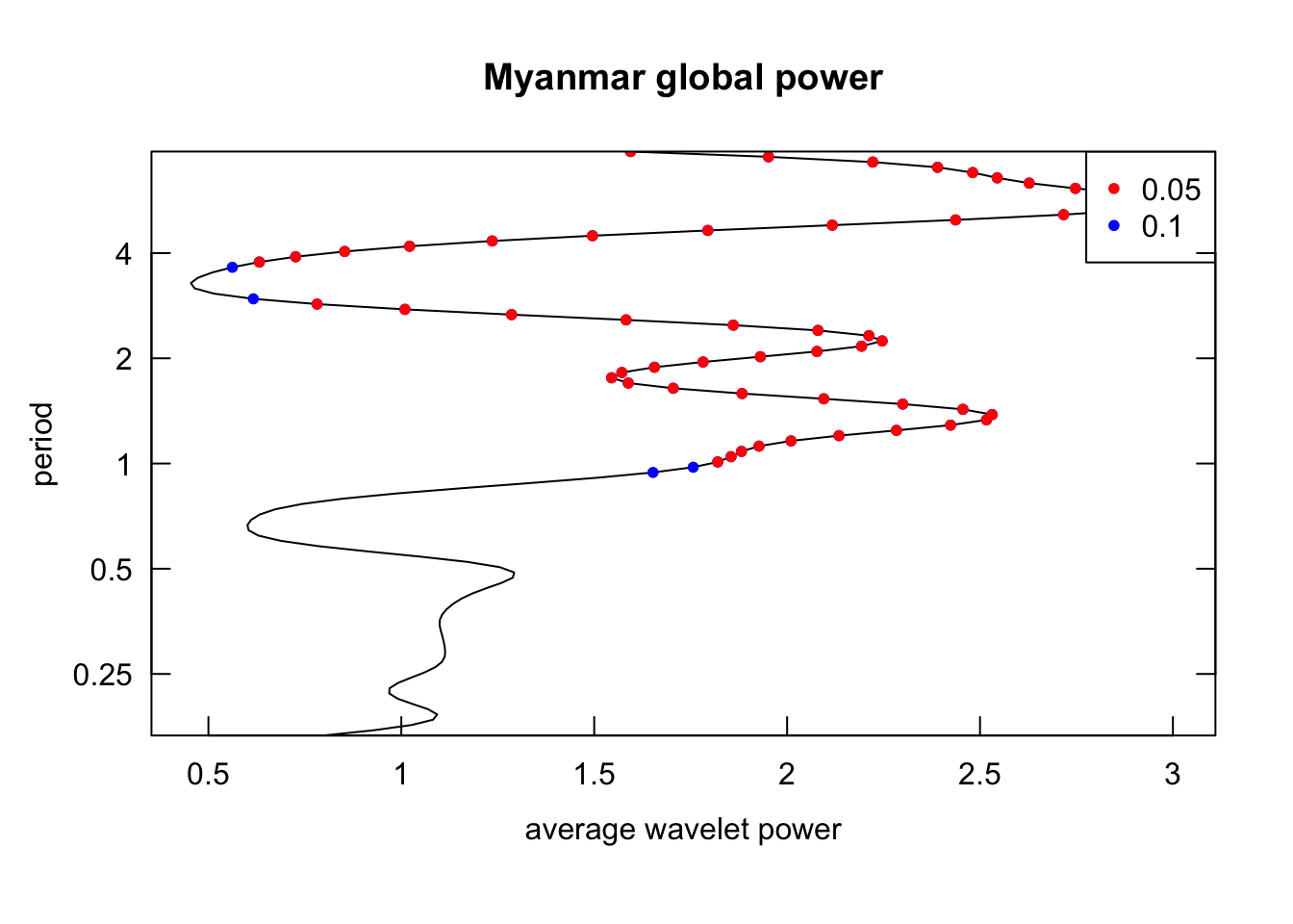
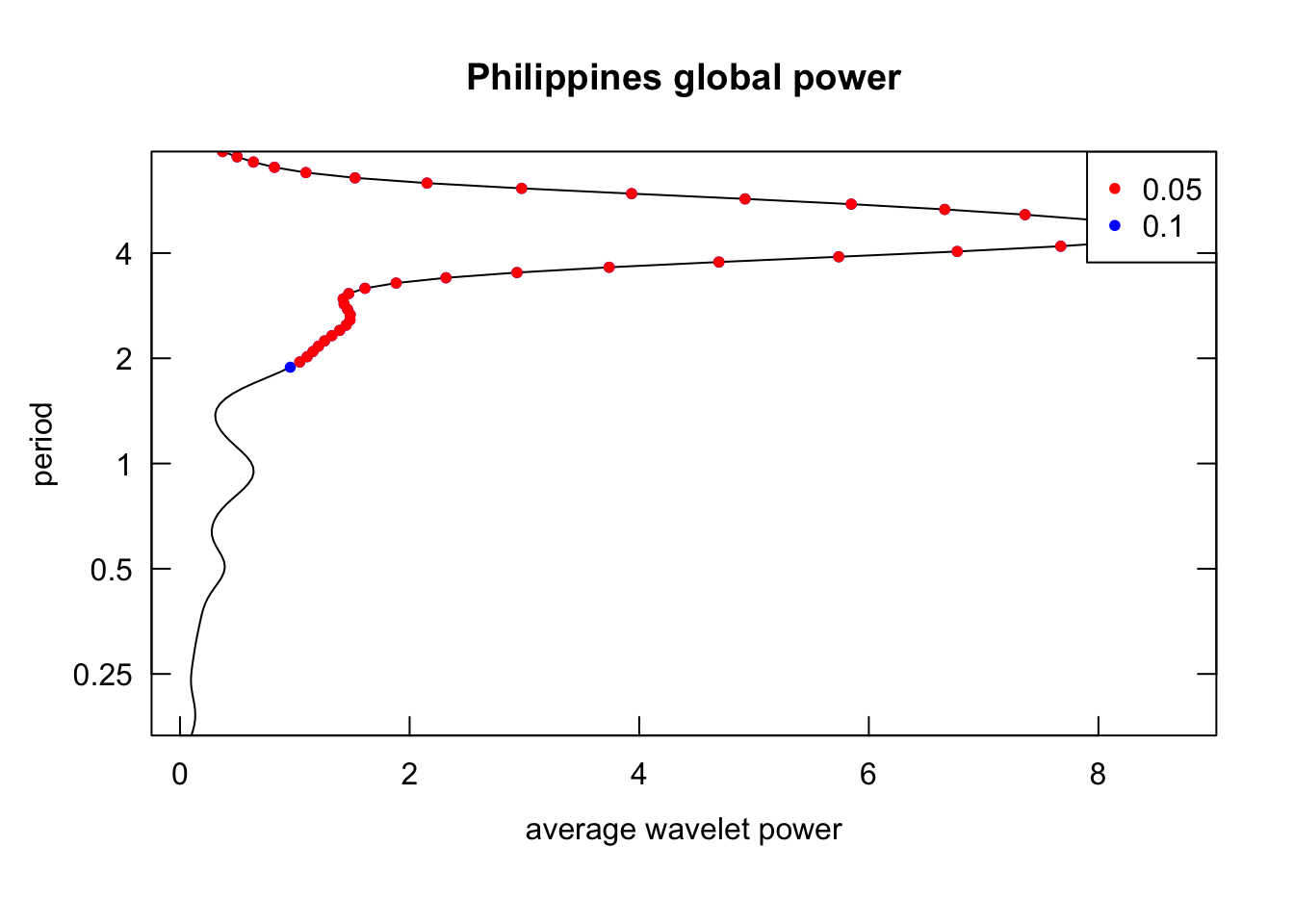
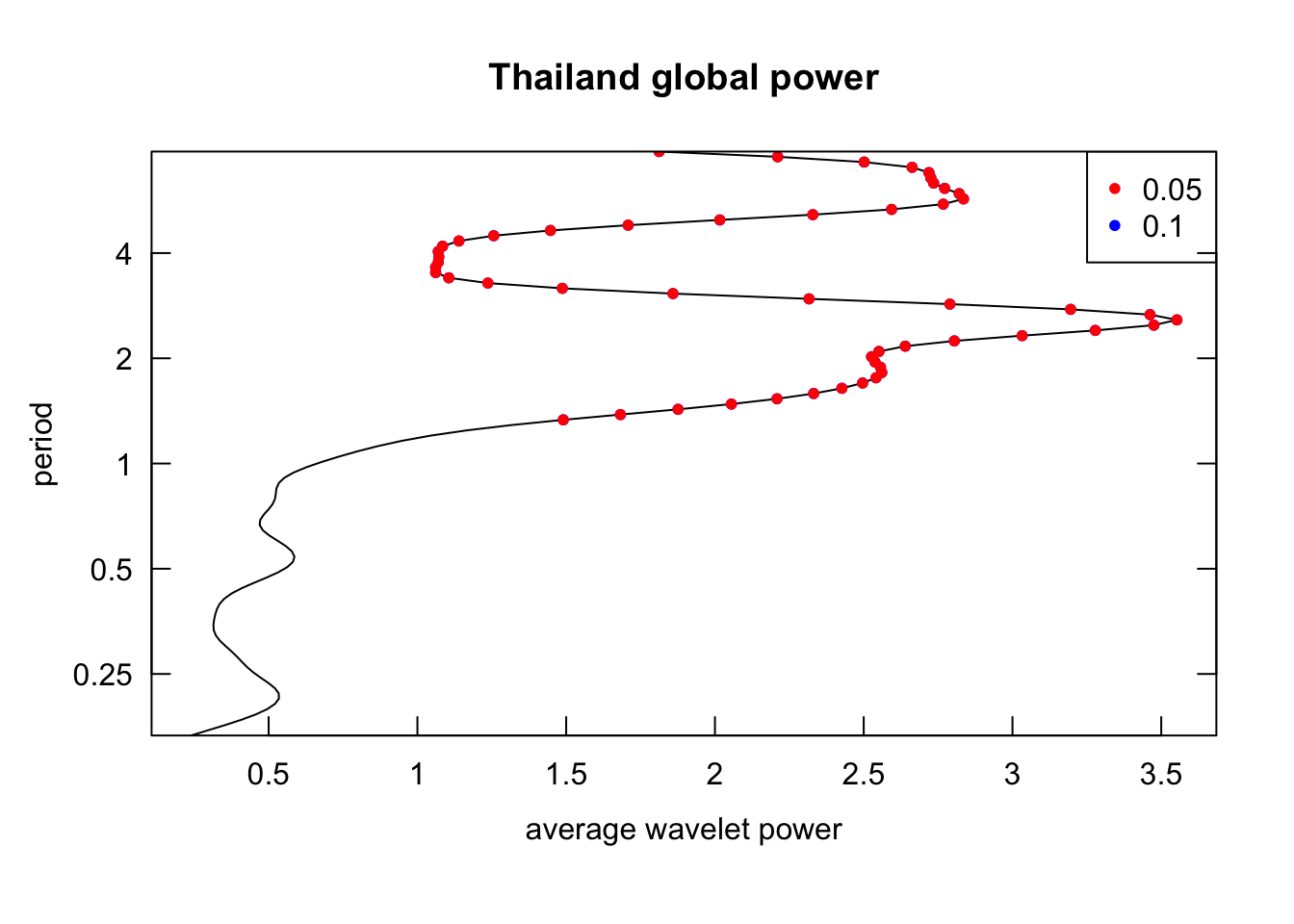
Inspect the global power (time-averaged power, analogue of the Fourier transform): identify the overall dominant periodicities.
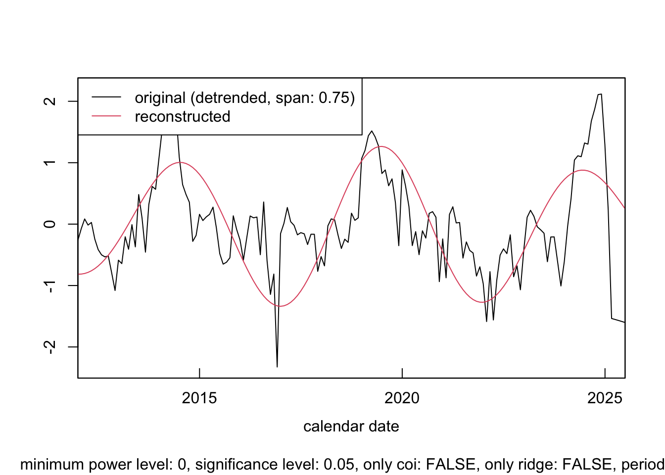
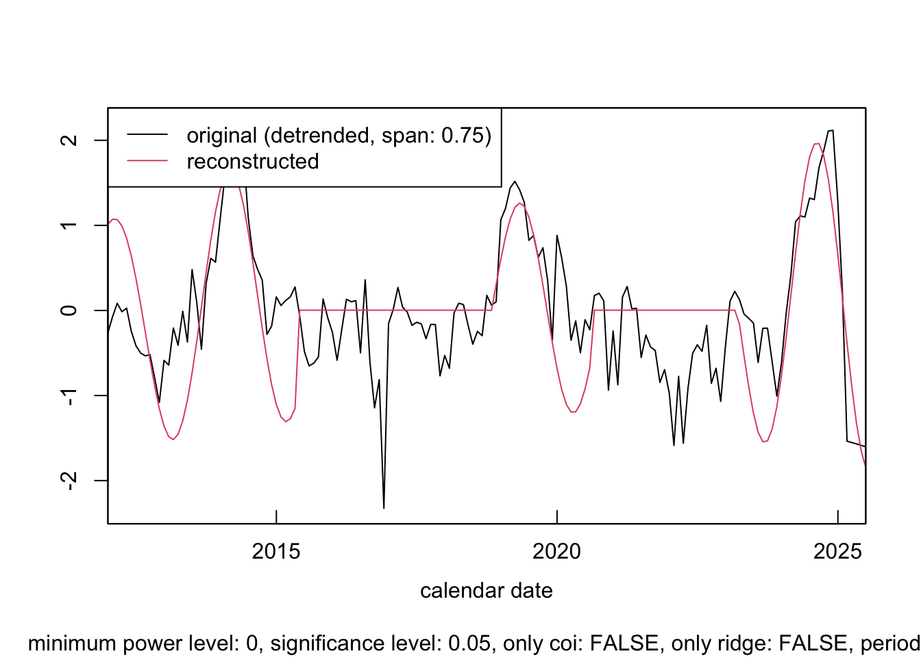
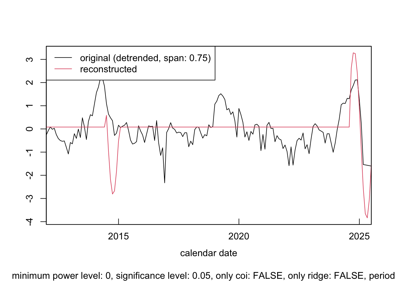
Inspect the period-specific reconstructed component: extract period-specific oscillations to assess their contributions to the time series.
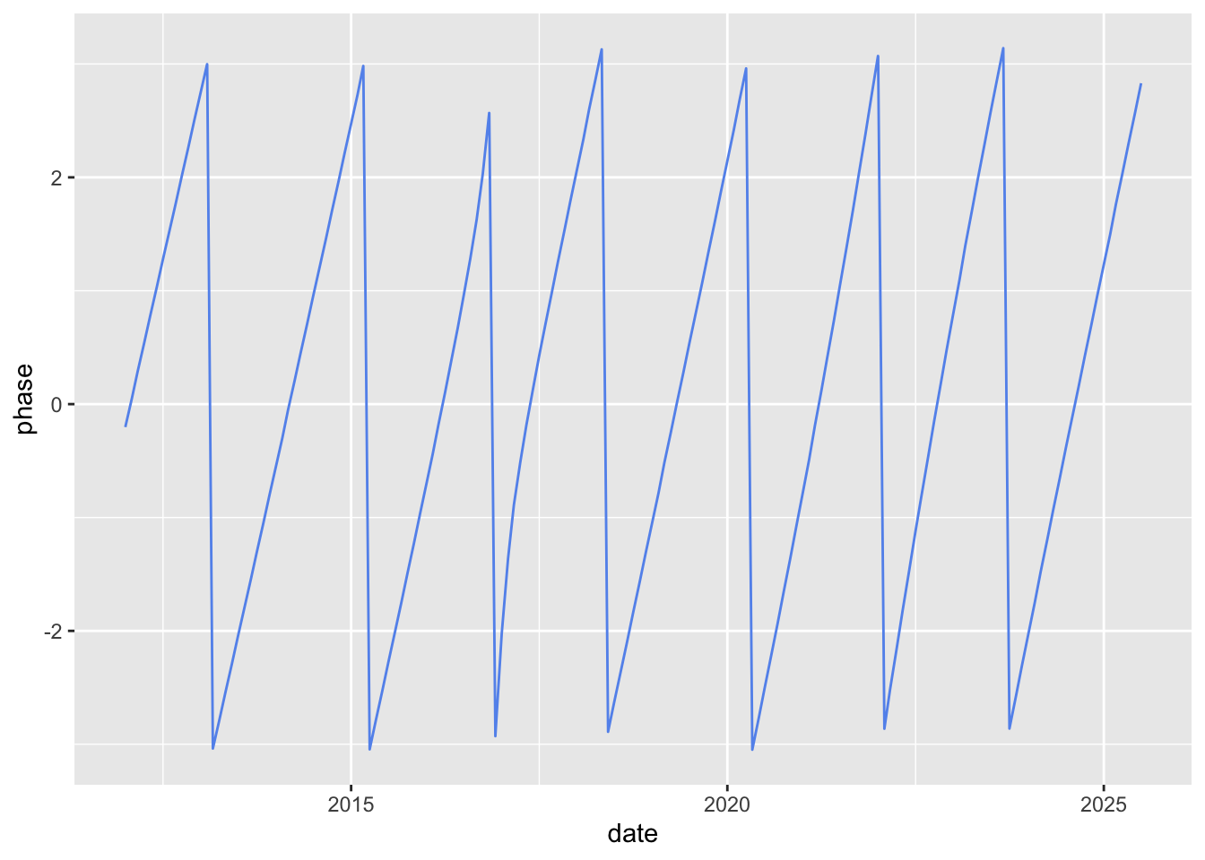
Inspect the period-specific phase: visualize the timing of cycles of different time series.
General setup
1 time unit is 1 year. Since the data is collected every month, dt = 1/12
The analyzed range of period is [1/6, 8] (i.e., 2 months to 8 years)
Analyze on Vietnam data only
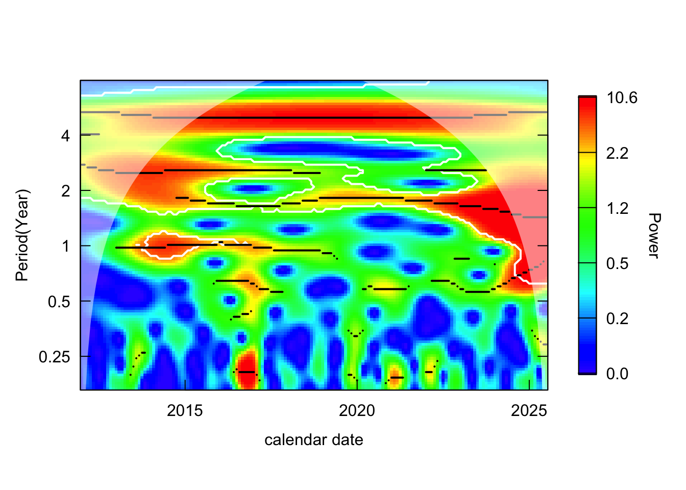
1. Check power spectrum across time-period
Consistently high power at period=5 suggests a cycle of major epidemic every 5-years, which can be observed from indicence data.
The plot also suggests (roughly) biennial cycle.
Annual cycle (seasonality) is only weakly detected before 2017 (maybe due to under-reporting).
# get the column for the 5-year periodrow_5year <-which.min(abs(wavelet$Period -5))data.frame(date = wavelet$series$date,phase = wavelet$Phase[row_5year,]) %>%ggplot() +geom_line(aes(x = date,y = phase ), color ="cornflowerblue" )
Plot phase
# get the column for the 2-year periodrow_2year <-which.min(abs(wavelet$Period -2))data.frame(date = wavelet$series$date,phase = wavelet$Phase[row_2year,]) %>%ggplot() +geom_line(aes(x = date,y = phase ), color ="cornflowerblue" )
Perform analysis on all data
Exclusion criteria:
Percentage of records where incidence = 0 greater than 50% (Brunei, Timer-Leste, Laos, Cambodia)
Low case count across time series (Singapore)
Perform wavelet data analysis on SEA countries
analyze_countries <-c("Thailand", "Myanmar", "Philippines", "Viet Nam", "Malaysia", "Indonesia")countries_wavelets <- log_transformed %>%filter(country %in% analyze_countries) %>%group_by(country) %>%nest() %>%mutate(wavelet =map(data, \(dat){capture.output( out <- dat %>%analyze.wavelet(my.series ="incidence",dt =1/12, # 1 time unit = 1 year lowerPeriod =1/6, # 2 monthsupperPeriod =8, # yearsverbose =FALSE ) ) %>%invisible() out }) ) %>%select(country, wavelet) %>%deframe()
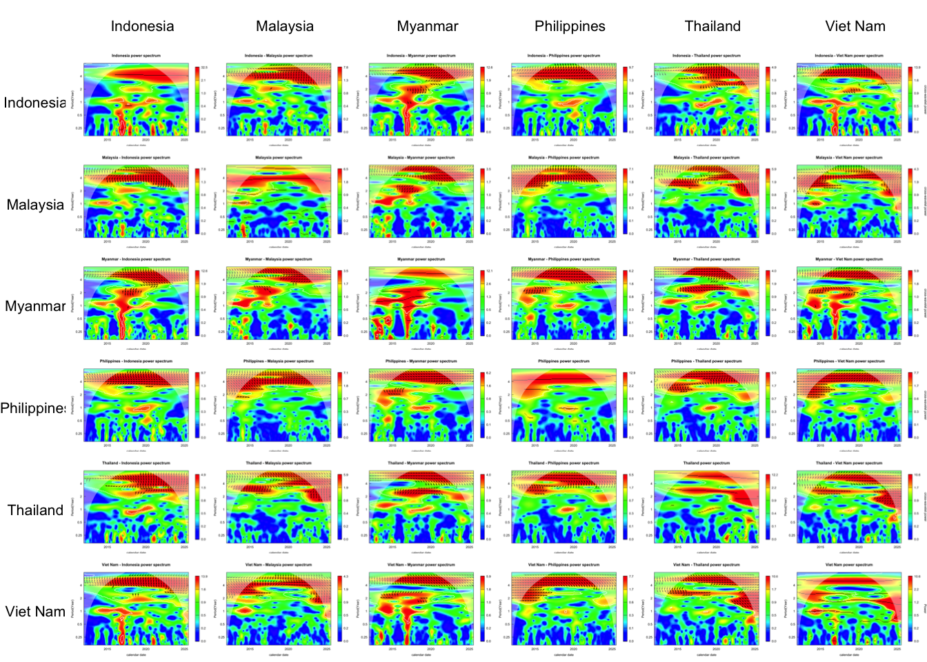
Power spectrum
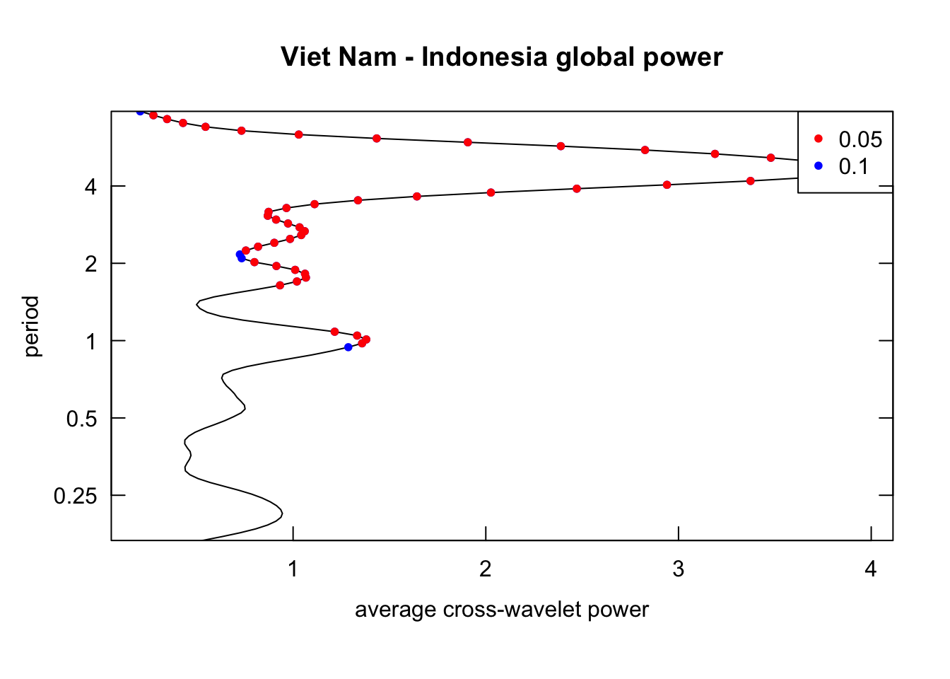
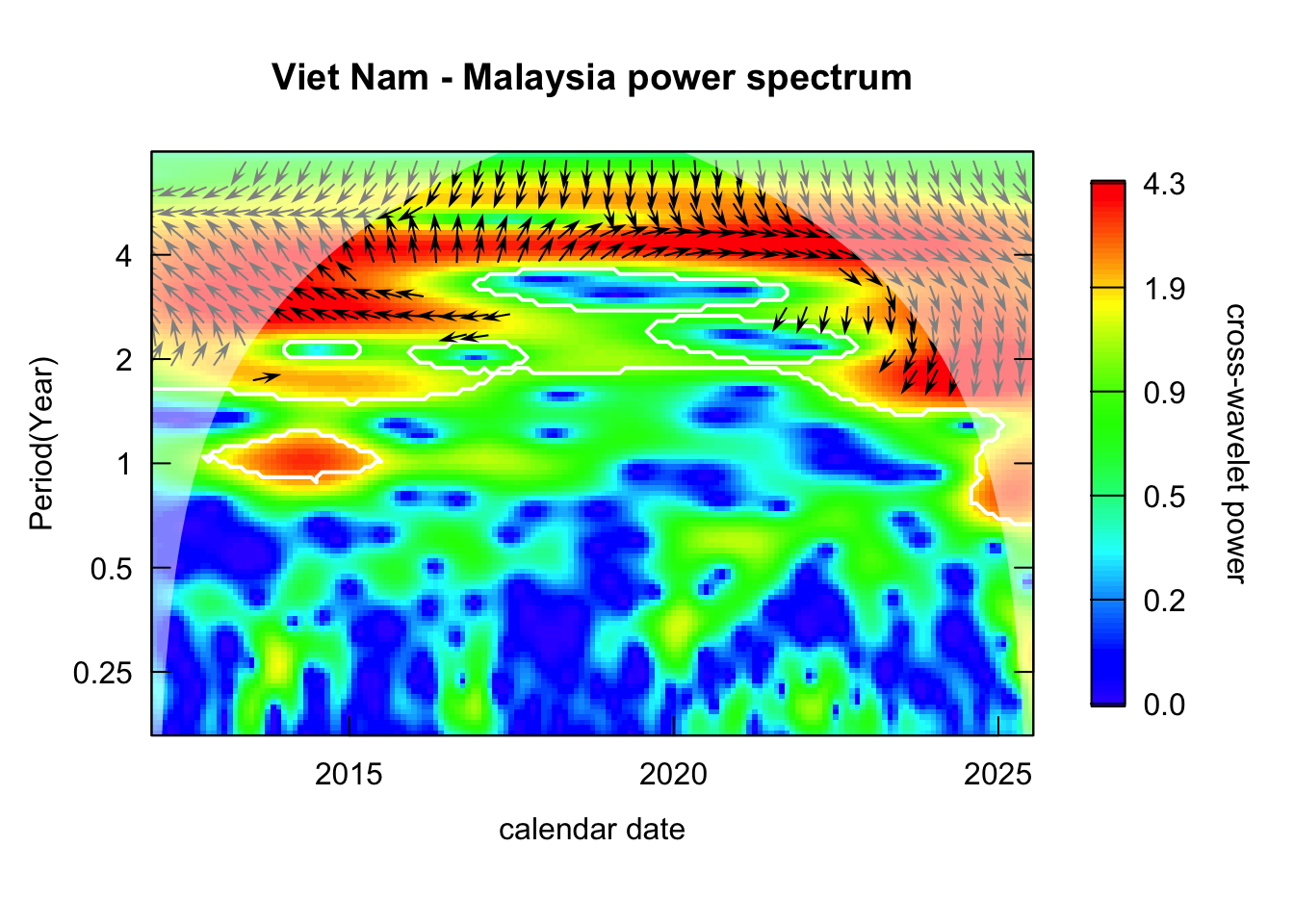
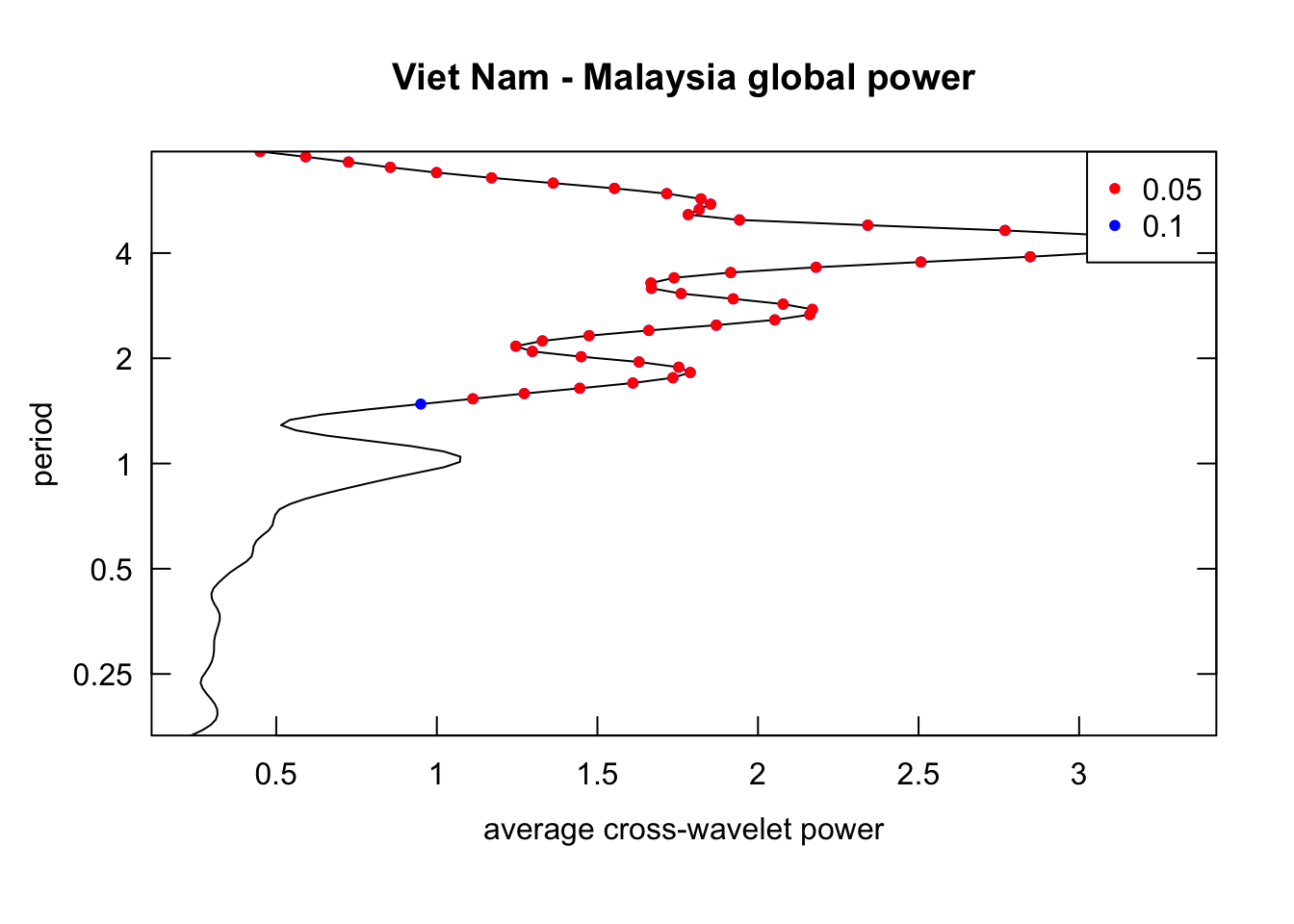
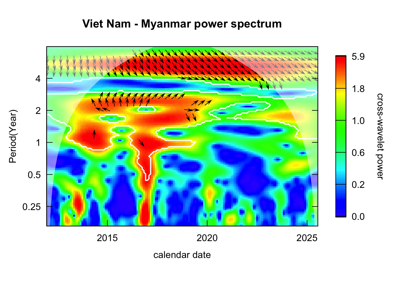
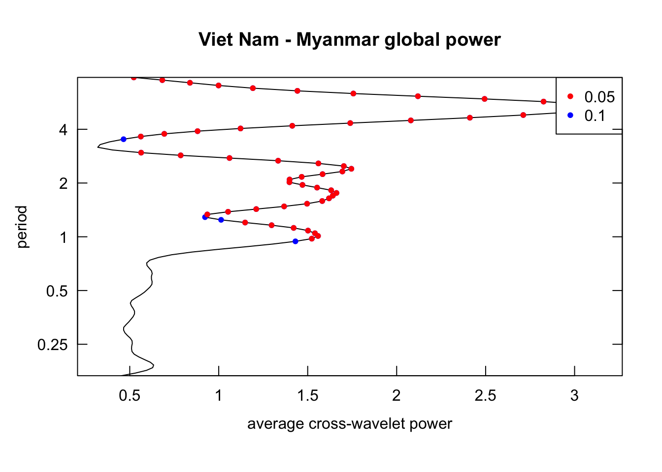
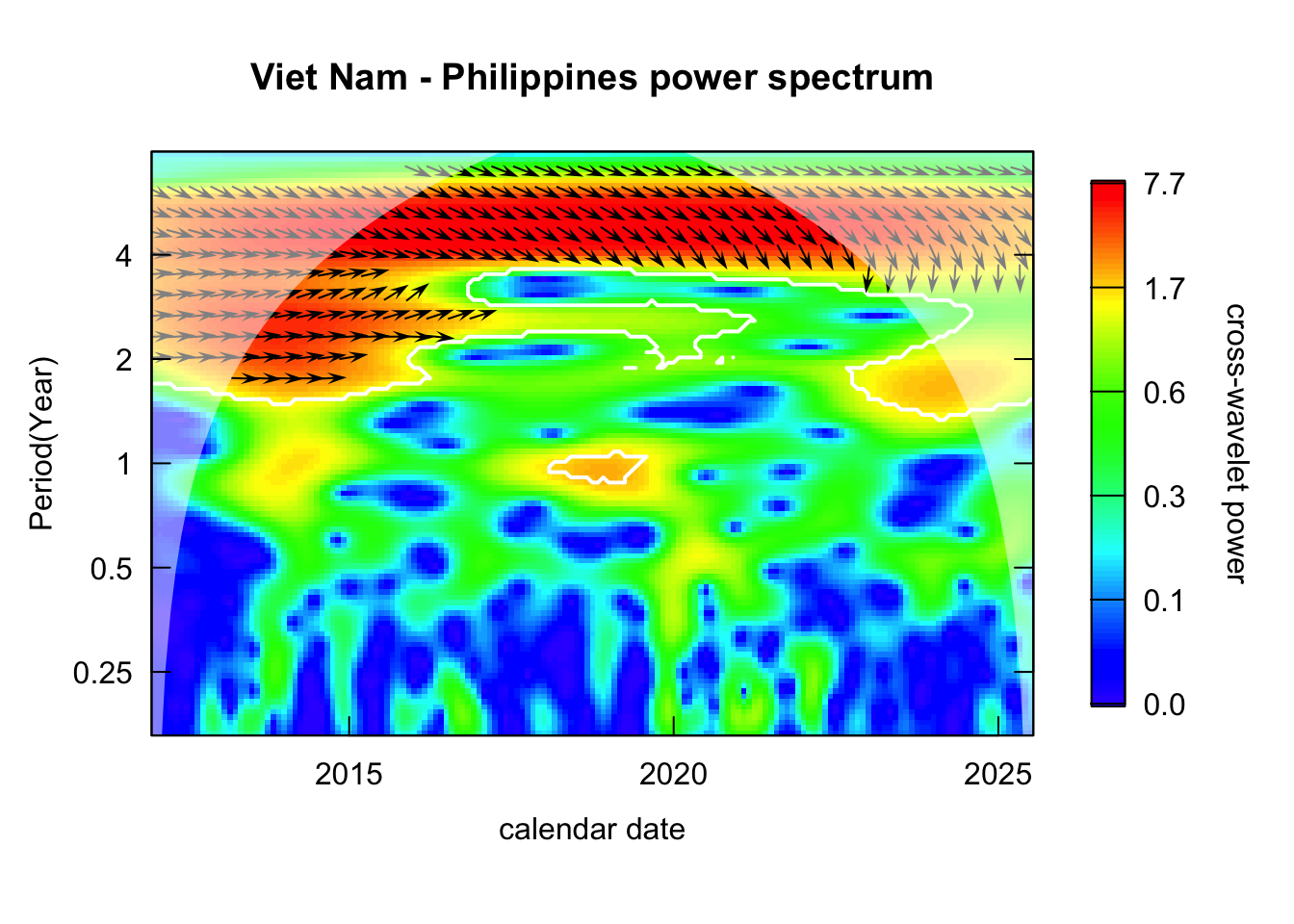
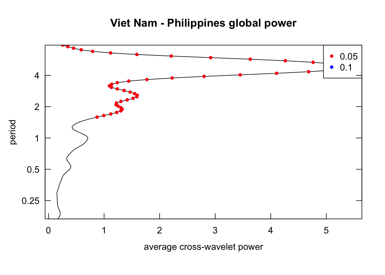
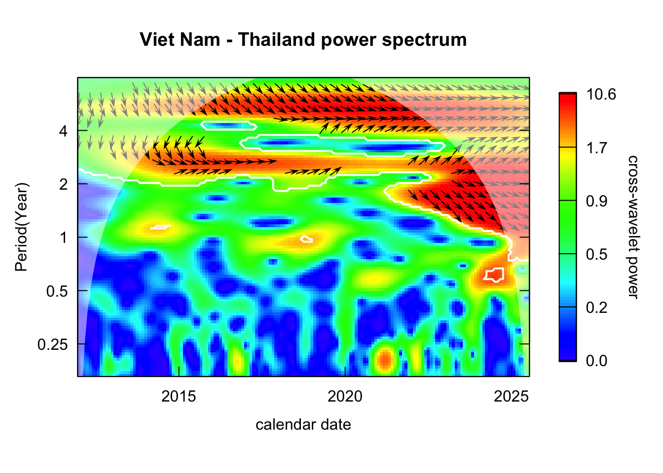
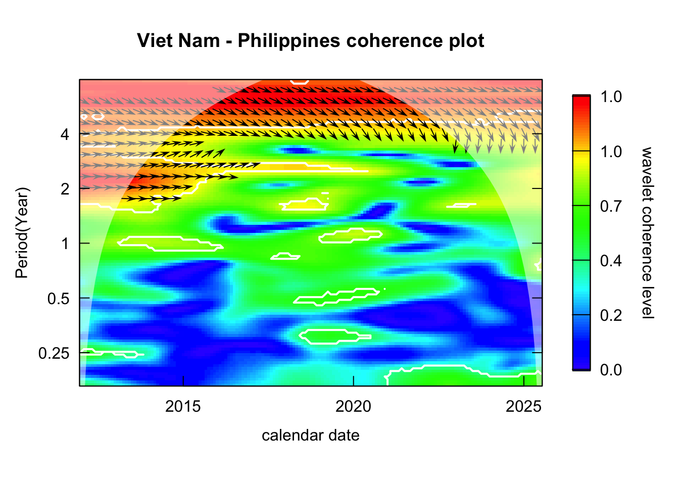
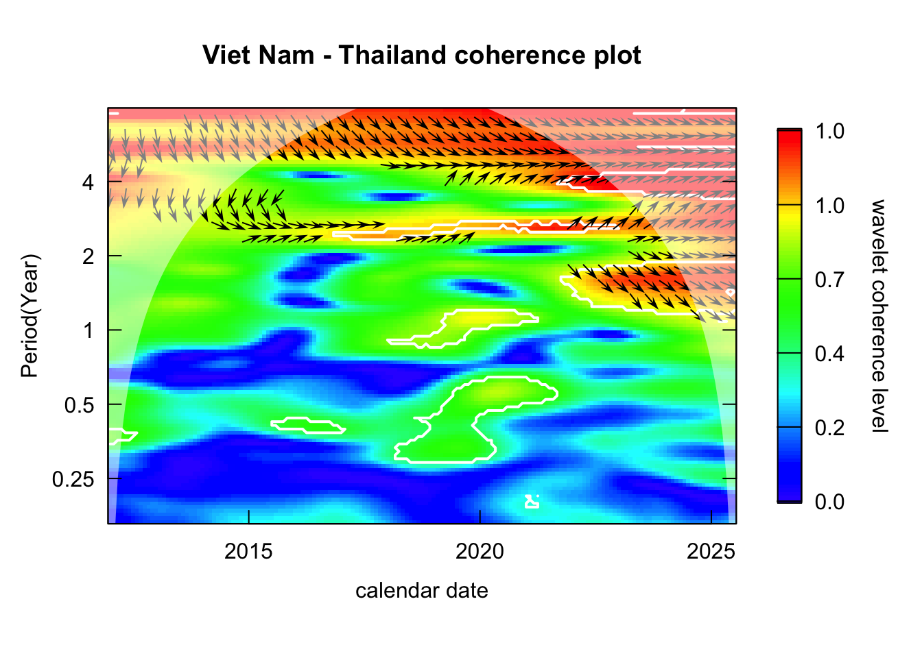
These plots suggest that most analyzed SEA countries experience measles epidemic every 4-5 years
Function to plot power spectrum of all countries
plot_power <-function(wavelets){# return heatmap of power and also global powerimap(wavelets, \(wavelet, country){wt.image( wavelet,main =paste0(country, " power spectrum"),legend.params =list(lab ="Power"),periodlab ="Period(Year)",show.date =TRUE ) spectrum <-recordPlot()wt.avg( wavelet,main =paste0(country, " global power") ) global_power <-recordPlot()list("spectrum"= spectrum,"global_power"= global_power ) })}
Take the average of the components of period ranging from 4-5.
Clear oscillations can be observed across all the countries, which further confirm the observations from previous section.
ggplotly(reconstruct_ts(countries_wavelets, period =c(4,5))$plot)
Roughly biennial component. Take the average of the components of period ranging from 1.9-2.5.
Relatively consistent oscillation can be observed for Vietnam and Thailand which suggests biennial cycle exists for these 2 countries.
ggplotly(reconstruct_ts(countries_wavelets, period =c(1.9, 2.5))$plot)
The plot suggests no SEA country exhibits consistent annual measles cycles
ggplotly(reconstruct_ts(countries_wavelets, period =1)$plot)
Phase
Function to plot period-specific phase
compute_phase <-function(wavelets, period =5){ df <-map2_dfr(wavelets, names(wavelets), \(wavelet, country){# if only one period is given -> select the closest period# else select all period within the range row_period <-if(length(period) ==1) which.min(abs(wavelet$Period - period)) elsewhich( (wavelet$Period >=min(period)) & (wavelet$Period <=max(period)) )data.frame(date = wavelet$series$date,# compute mean phase across all selected periodsphase =if(length(row_period) >1) colMeans(wavelet$Phase[row_period,]) else wavelet$Phase[row_period,] ) %>%mutate(country = country,.before =1 ) }) plot <- df %>%ggplot() +geom_line(aes(x = date, y = phase, color = country) ) +labs(y ="Phase",x ="Date" )# return data.frame and plotlist(df = df,plot = plot )}
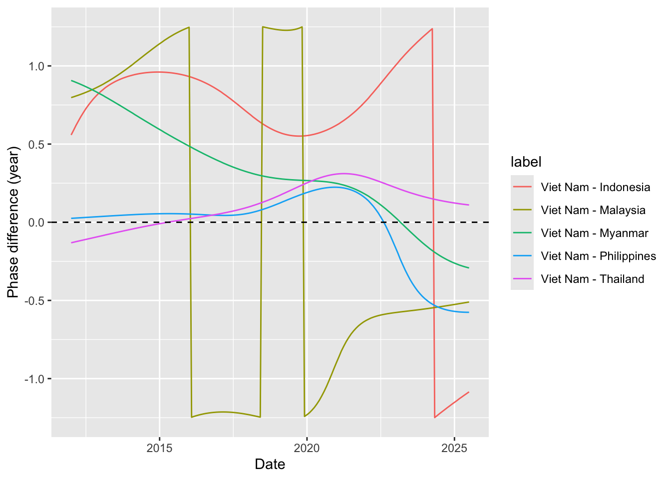
countries_phase <-compute_phase(countries_wavelets, period =5)ggplotly(countries_phase$plot)
Roughly biennial epidemic
countries_phase <-compute_phase(countries_wavelets, period =2.5)ggplotly(countries_phase$plot)
Biwavelet analysis
Follow these steps of cross-wavelet analysis:
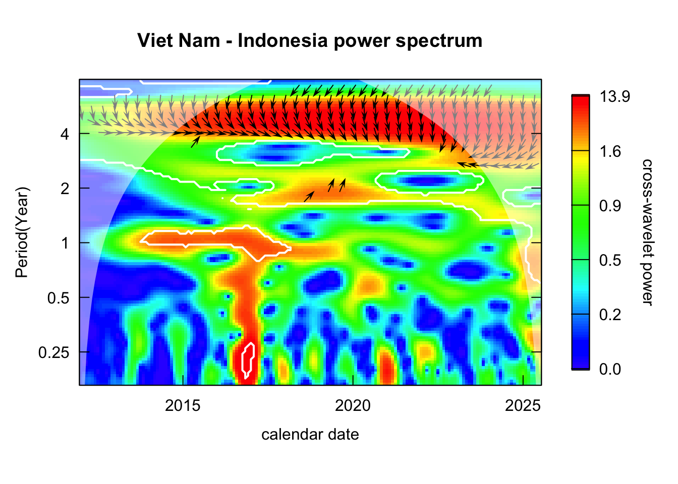
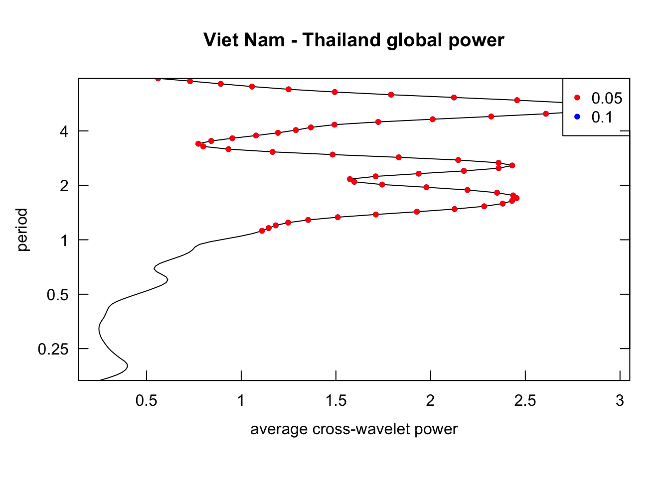
Inspect the cross-wavelet power spectrum: identify the period that consistently recurring for both pair of time series.
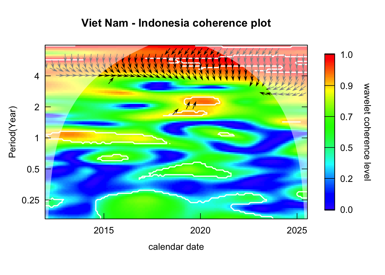
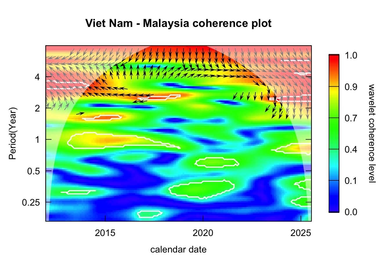
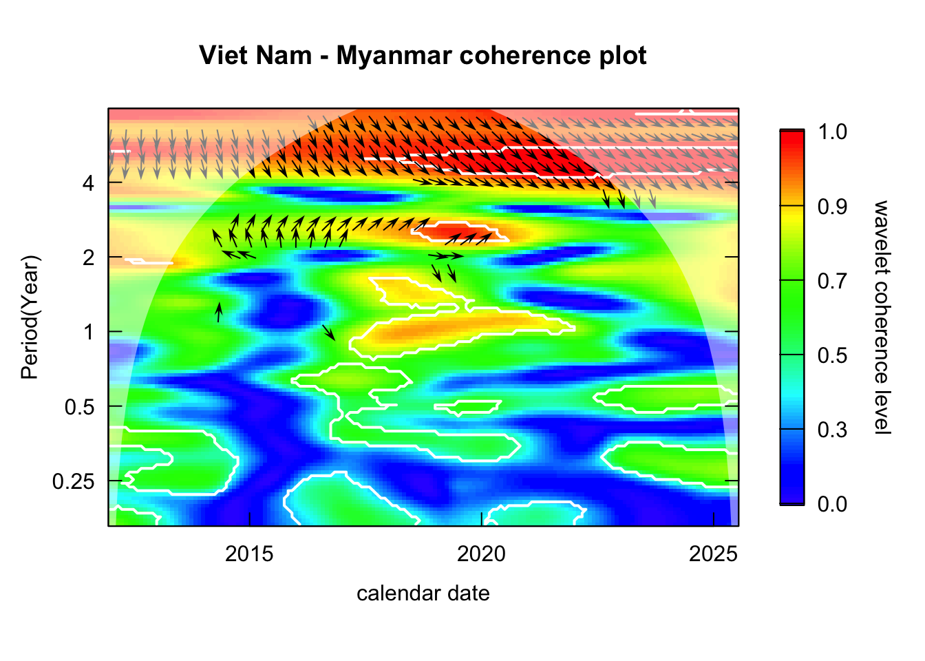
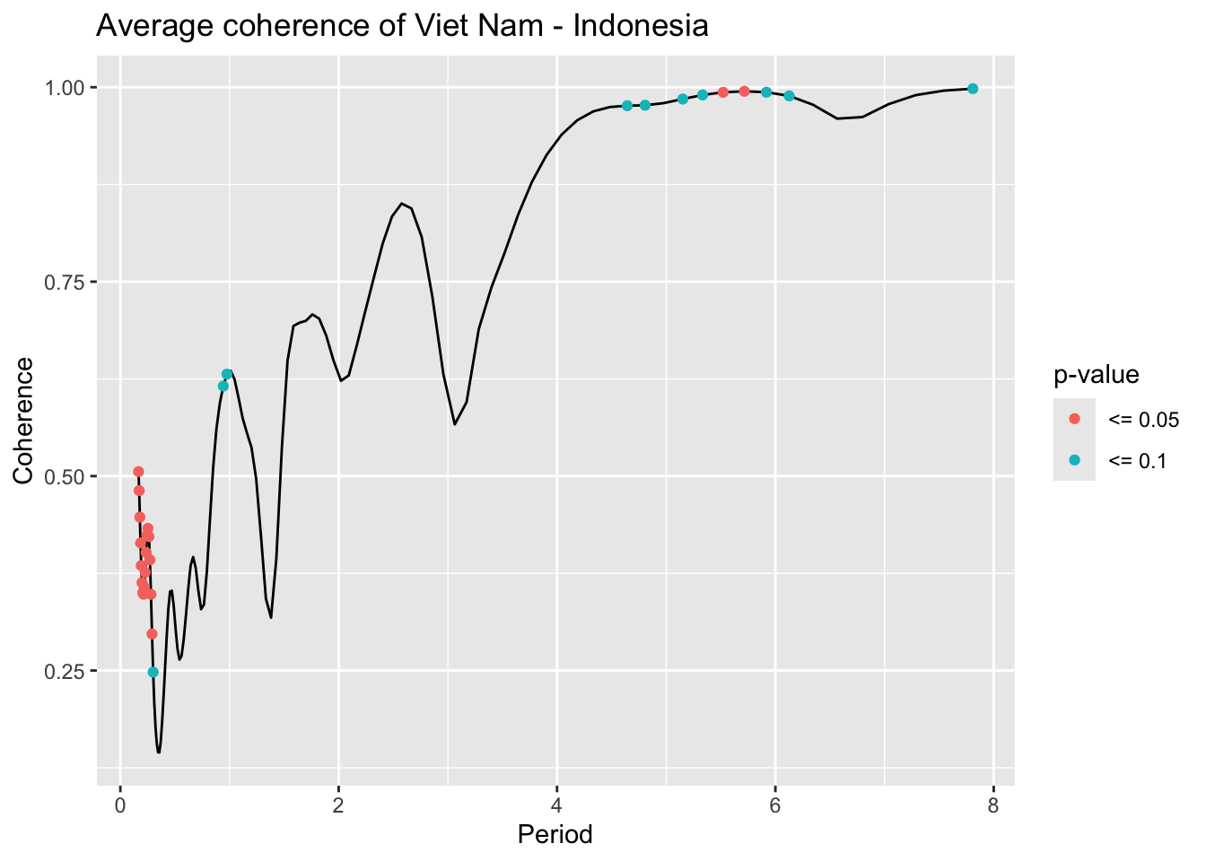
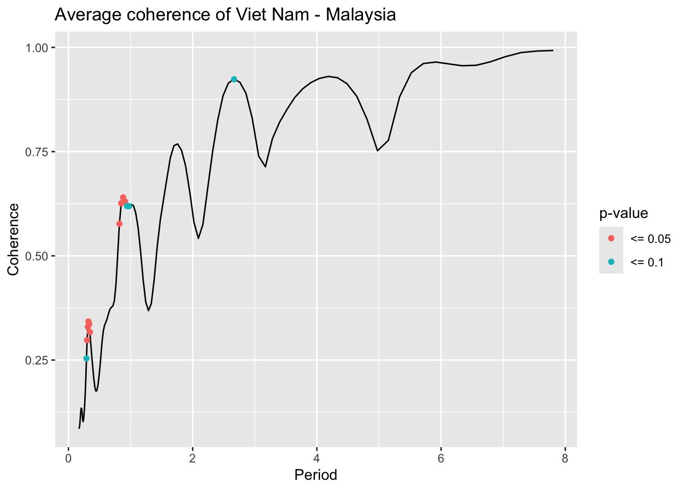
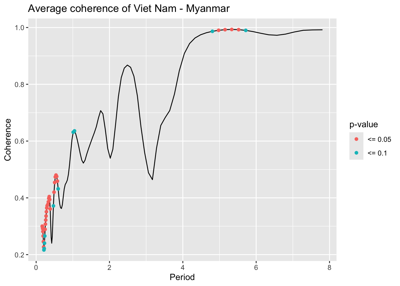
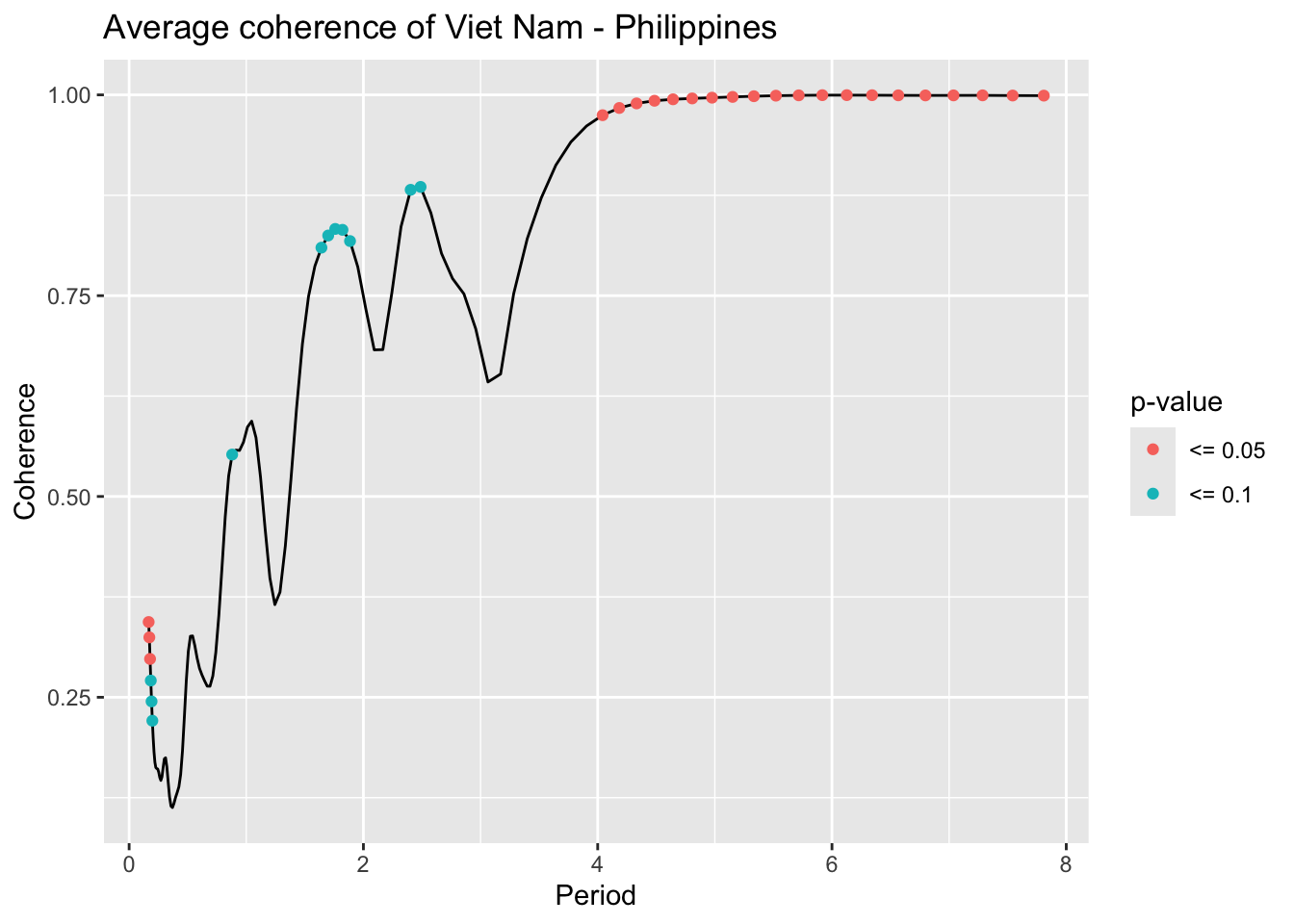
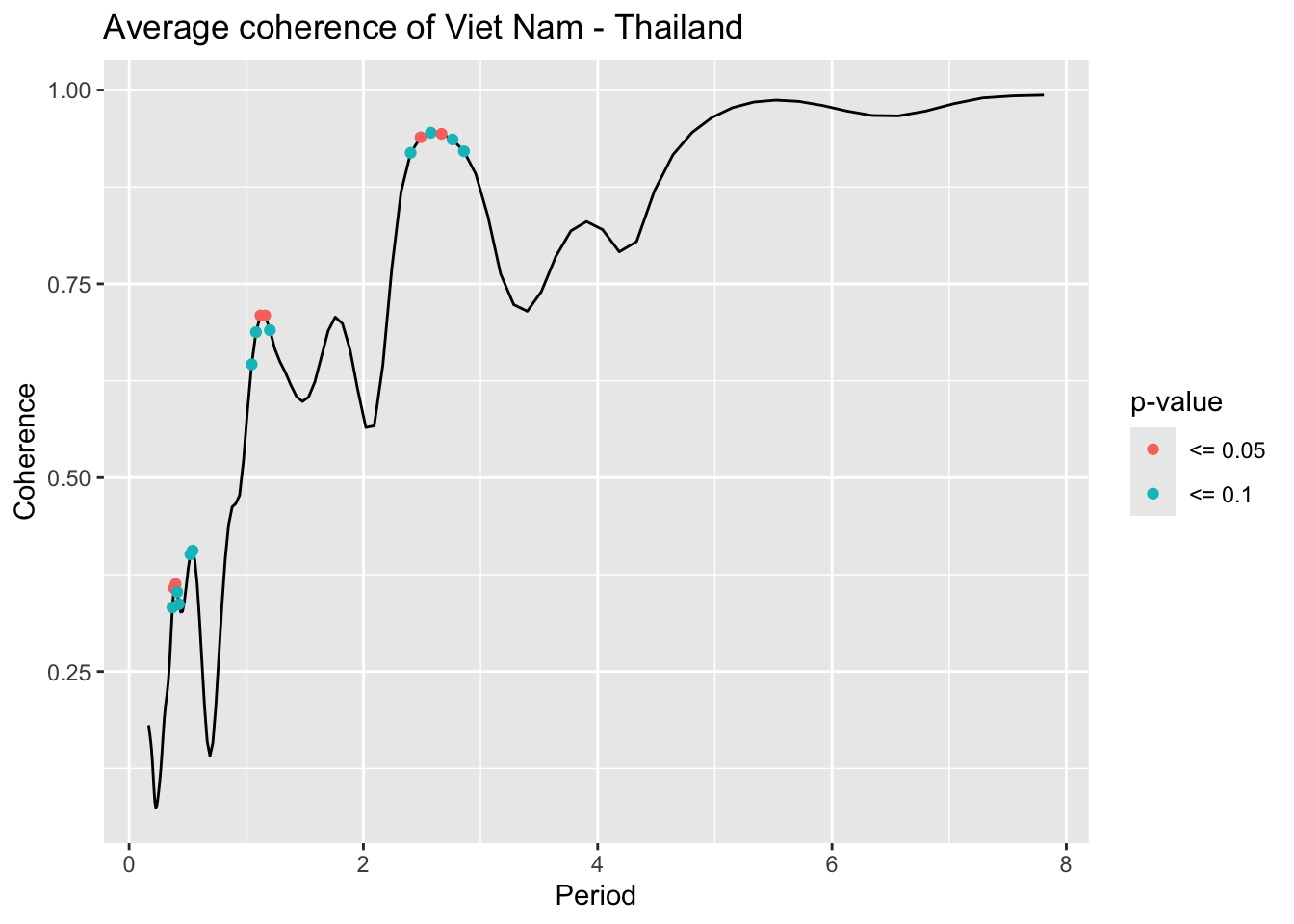
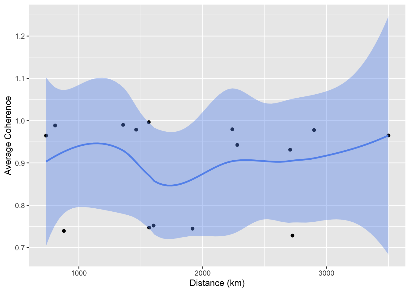
Inspect the coherence spectrum: identify the period where the pair of time series consistently correlates.
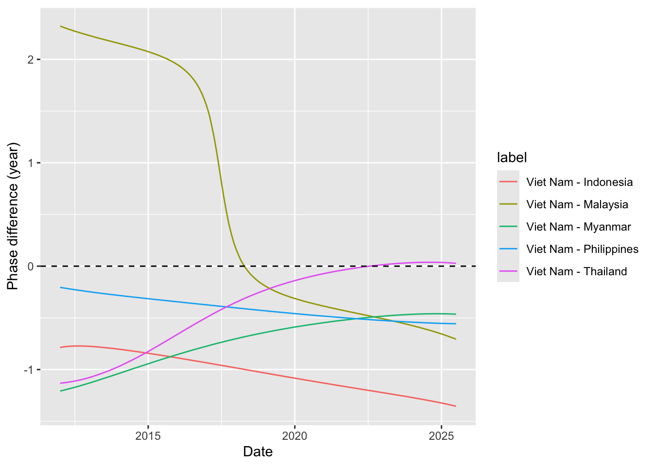
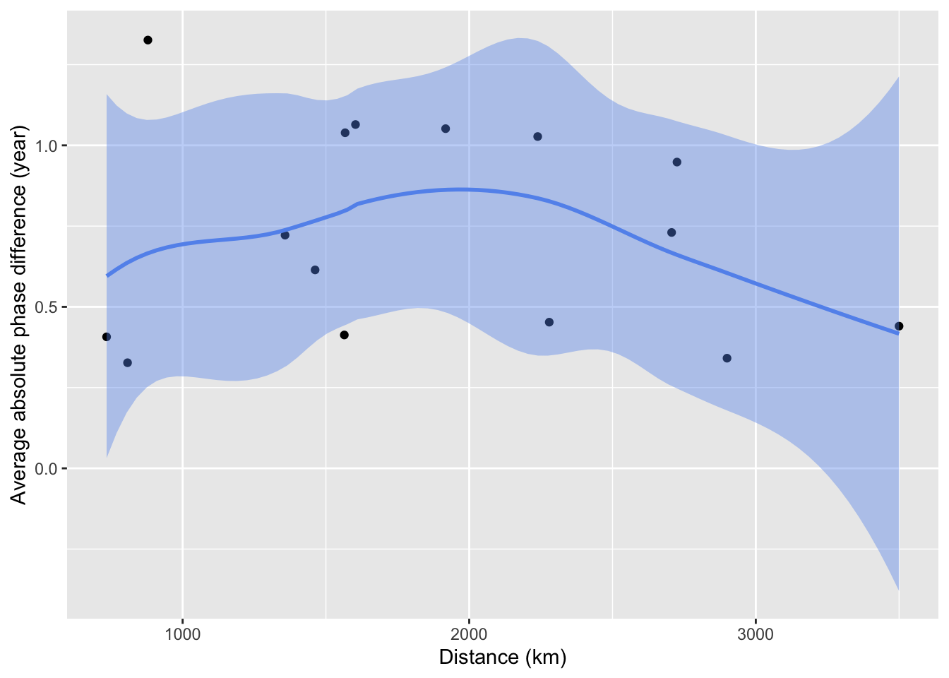
Inspect the period-specific phase difference: check the relative timing of the 2 time series (which series lead the other).
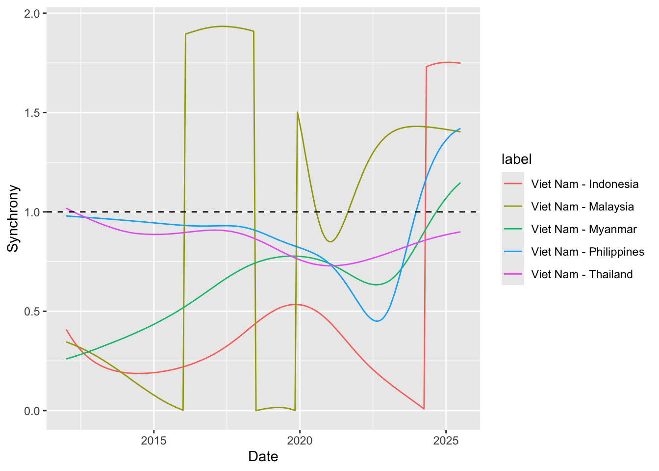
Compute and inspect the period-specific synchrony: check how closely the 2 time series align.
Function to generate biwavelet analyses for multiple pairs
library(janitor)# Function that takes data instead of wavelets# wavelets, period = 5, ref_country = "Viet Nam", constraint = TRUE, diff_to_time = TRUE# when ref_country is not found, generate all unique pairs # when repeated = TRUE, included permutations of pairs intead of combinationsgenerate_biwavelet_analysis <-function(data, ref_country ="Viet Nam",repeated =FALSE,verbose =FALSE){ countries <-unique(data$country)# generate all unique pairs pairs <-if(!repeated) combn(countries, 2, simplify =FALSE) elseexpand.grid(countries, countries) %>%filter(Var1 != Var2) %>%apply(1, \(row){as.character(row)}, simplify =FALSE)# if ref country is provided, keep pairs with the ref_country# also make sure ref country is the first time seriesif (!is.na(ref_country)){ pairs <-keep(pairs, \(p) ref_country %in% p) pairs <-map(pairs, \(p) {if (p[1] == ref_country) p elserev(p) }) } coherence <-map(pairs, \(curr_pair){capture.output( out <- data %>%filter( country %in% curr_pair ) %>%select(country, date, incidence) %>%pivot_wider(names_from = country,values_from = incidence ) %>%as.data.frame() %>%analyze.coherency(my.pair = curr_pair,dt =1/12,lowerPeriod =1/6,upperPeriod =8,verbose = verbose ) ) %>%invisible() out })names(coherence) <-map_chr(pairs, \(pair) paste(pair, collapse =" - ")) coherence}
Function to generate cross-wavelet power spectrum plot
plot_cwavelet_power <-function(coherence_list){# return heatmap of power and also global powerimap(coherence_list, \(coherence, label){wc.image( coherence,# set significance level for drawing contour (white line around an area)siglvl.contour =0.1, # set significance level for drawing arrowssiglvl.arrow =0.05, which.arrow.sig ="wt",main =paste0(label, " power spectrum"),legend.params =list(lab ="cross-wavelet power"),periodlab ="Period(Year)",show.date =TRUE ) spectrum <-recordPlot()wc.avg( coherence,main =paste0(label, " global power") ) global_power <-recordPlot()list("spectrum"= spectrum,"global_power"= global_power ) })}
# expected input to be the output from function compute_synchronyprepare_plot_data <-function(synchrony_out, centroid_df = iso_centroid){ synchrony_out$df %>%# ---- compute mean coherence-weighted phase differencegroup_by(label) %>%summarize(avg_phase_diff =sum(coherence * phase_diff)/sum(coherence) ) %>%separate(label, into =c("from", "to"), sep =" - ") %>%mutate(from =countrycode(from, origin ="country.name", destination ="iso3c"),to =countrycode(to, origin ="country.name", destination ="iso3c") ) %>%# ---- swap from and to countries if the avg_phase_diff is negative (i.e. the "to" is actually the leading time series)mutate(tmp =if_else(avg_phase_diff <0, from, to),from =if_else(avg_phase_diff <0, to, from),to = tmp,# since we already use the sign for determine the direction, keep absolute value onlyavg_phase_diff =abs(avg_phase_diff) ) %>%select(-tmp) %>%# ---- get the coordinate of the centroid of each countryleft_join(# get coordinate of centroid of origin country centroid_df %>%rename(from_x = x, from_y = y),by =join_by(from == iso) ) %>%left_join(# get coordinate of centroid of destination country centroid_df %>%rename(to_x = x, to_y = y),by =join_by(to == iso) )}# get data.frame of iso and coordinate of centroid of that country# iso_centroid <- map_data %>% # as_tibble() %>% # mutate(# centroid = st_coordinates(st_point_on_surface(sf.geometry)),# x = centroid[,"X"],# y = centroid[,"Y"]# ) %>% # select(iso, x, y)# try centroid from CoordinateCleaner packageiso_centroid <- countryref %>%filter( iso3 %in% sea_iso, type =="country" ) %>%# for each country, only keep the first recordgroup_by(iso3) %>%slice(1) %>%ungroup() %>%rename(iso = iso3,x = centroid.lon,y = centroid.lat ) %>%select(iso, x, y)
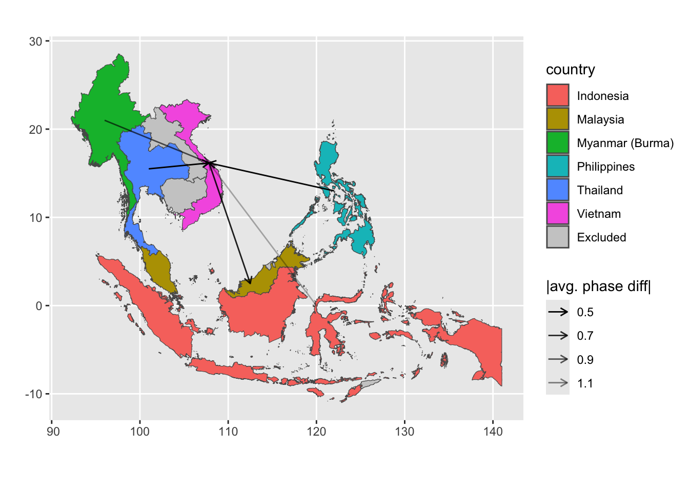
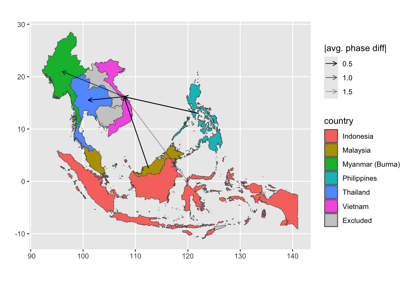
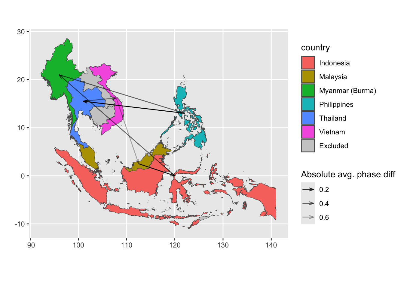
Vietnam measles wave
Visualize the direction of measles wave relative to Vietnam.
General interpretation of the plot:
Arrow indicates which time series leads (to) the other (i.e., pointing from the leading one to the lagging one).
Arrow boldness is determined by the absolute coherence-weighted average weight difference. Bolder arrow indicates that the lagging time series is more closely aligned with the leading time series.